CommerceIQ - Manage Negative Keywords
CommerceIQ - Manage Negative Keywords
CommerceIQ - Manage Negative Keywords
A negative keywords management flow for ad-campaigns
The goal of this project was to design a conversational search app using natural language processing to enable employees to access, search, and retrieve enterprise documents efficiently.
The goal of this project was to design a conversational search app using natural language processing to enable employees to access, search, and retrieve enterprise documents efficiently.
The goal of this project was to design a conversational search app using natural language processing to enable employees to access, search, and retrieve enterprise documents efficiently.
Role
Design owner, responsible for end-to-end design and primary point of contact for this project
Design owner, responsible for end-to-end design and primary point of contact for this project
Design owner, responsible for end-to-end design and primary point of contact for this project
Deliverables
Interactive high-fidelity prototype
Interactive high-fidelity prototype
Duration
2 Weeks
During my internship at CommerceIQ
2 Weeks
During my internship at CommerceIQ
Context
Context
Context
In this project, I have redesigned the negative keywords management flow such that it reduces user errors and task completion time.
In this project, I have redesigned the negative keywords management flow such that it reduces user errors and task completion time.
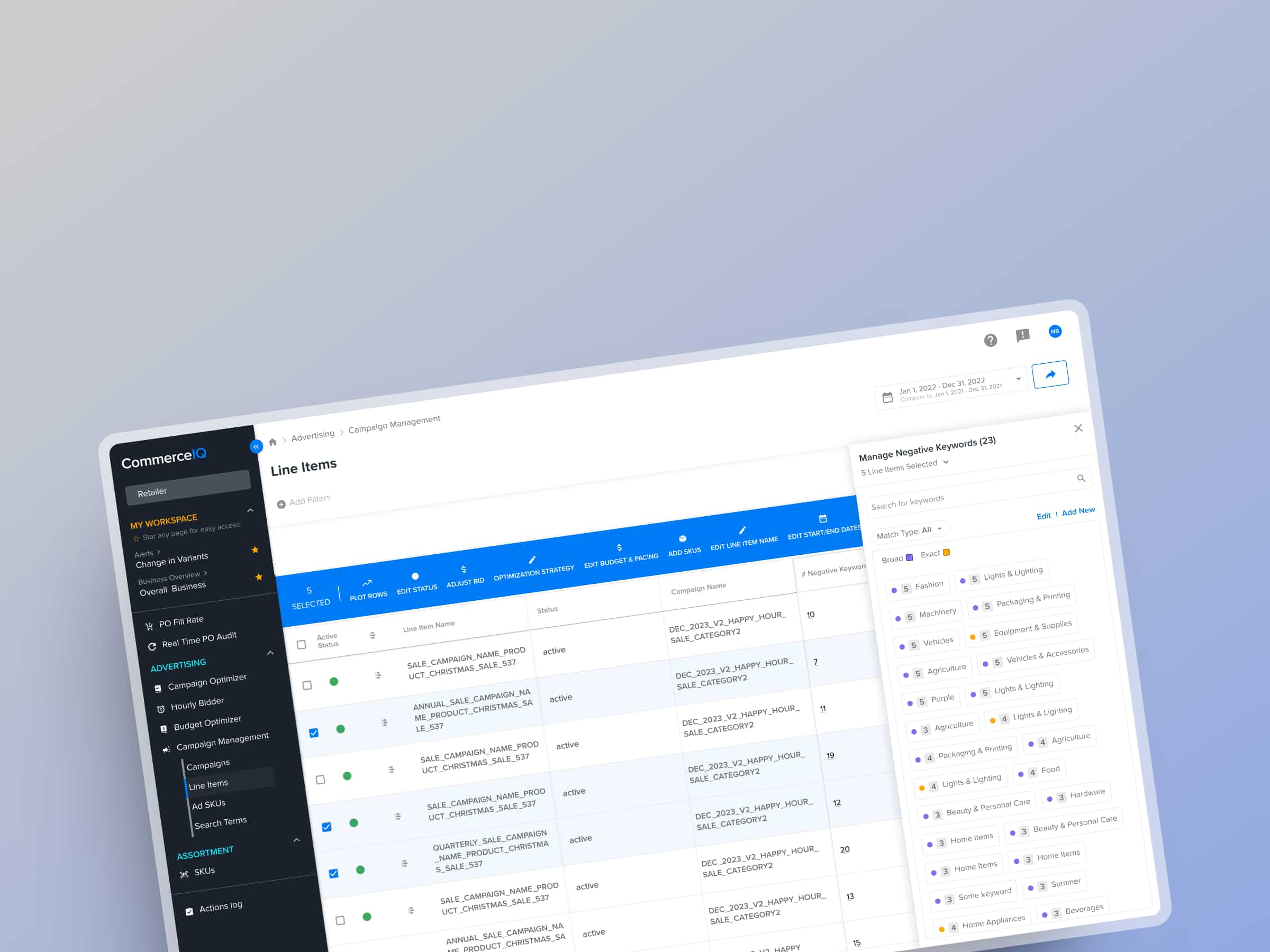
CommerceIQ's e-commerce retail management platform provides the ability to create and manage ad campaigns on various e-retailers in the US like Amazon, Walmart, Target, Instacart, etc.
CommerceIQ's e-commerce retail management platform provides the ability to create and manage ad campaigns on various e-retailers in the US like Amazon, Walmart, Target, Instacart, etc.
One aspect of managing an ad campaign is managing negative keywords. To put it in simple words, negative keywords are basically words for which you do not want your product to be promoted. Read more about negative keywords here.
One aspect of managing an ad campaign is managing negative keywords. To put it in simple words, negative keywords are basically words for which you do not want your product to be promoted. Read more about negative keywords here.
Existing Flow
Existing Flow
Existing Flow
Imagine that the user wants to add the word "chocolate" to the list of negative keywords. They select the ad group and this is what they see.
They can enter a list of words, 1000 maximum, separated by new line.
They can select the match type - broad or exact match.
Get a preview of words that are going to be added.
Apply changes.
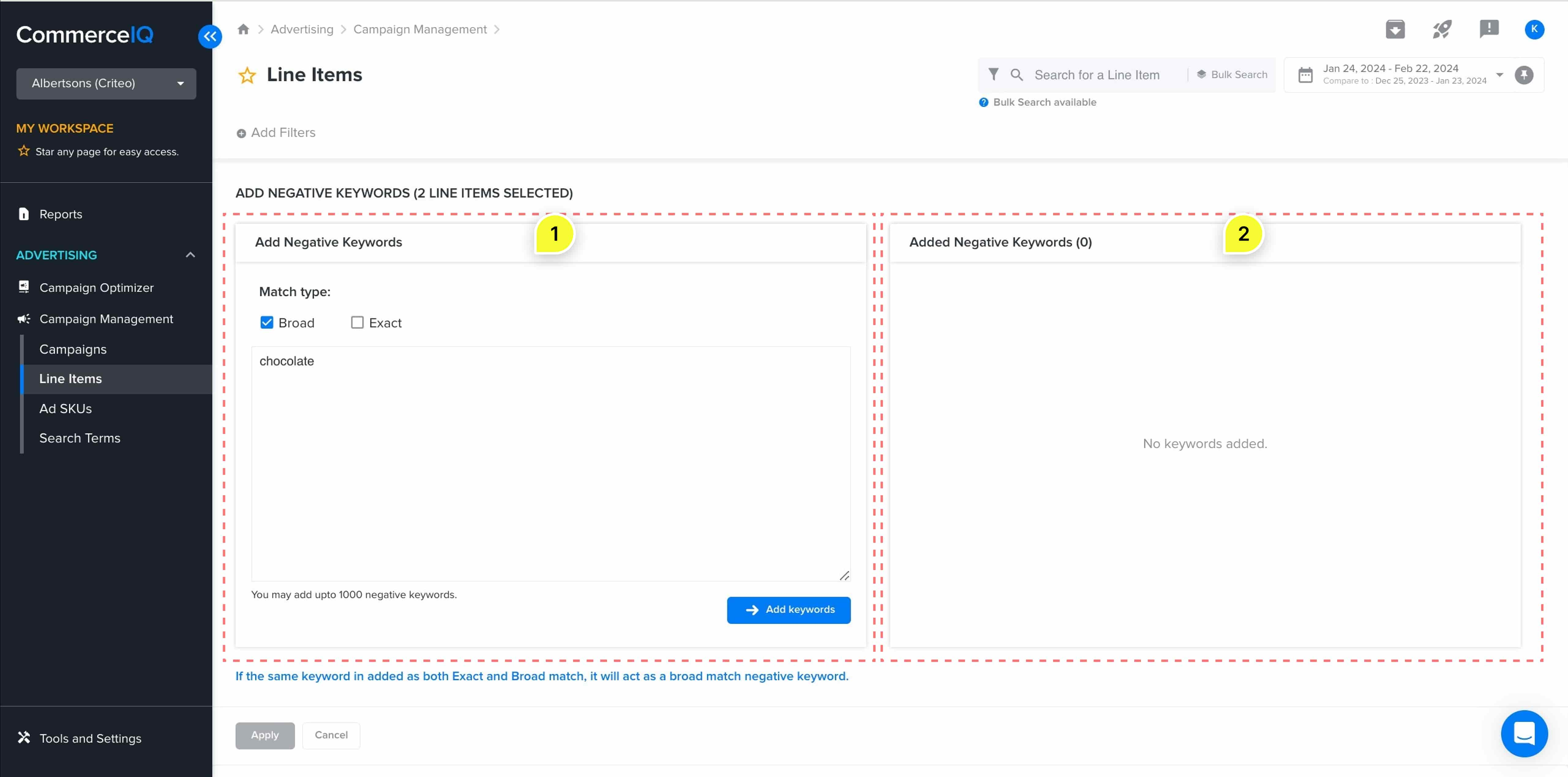
To add to the list of keywords, the user selects the match type and enters a comma separated or new line separated list of words.
After clicking on "Add Keywords", user gets a preview of words to be added. Once convinced, they can "Apply" the changes.
Issues with the existing flow
Issues with the existing flow
Issues with the existing flow
1. No support for viewing existing negative keywords.
1. No support for viewing existing negative keywords.
Currently, user cannot view existing keywords. So if they are trying to add the word chocolate, they don't know whether this already exists or not. Though adding it again won't likely be disastrous but knowing that it already exists can help save the double work.
Secondly, if they don't know what exists then how they remove unnecessary words from the list? Clearly, there is no support for this action.
2. Bulk actions are not supported.
2. Bulk actions are not supported.
Adding negative keywords happens at ad group level and there can be multiple ad groups under a single ad campaign. In the current flow, if we want to add the word "chocolate" to 5 such ad groups then we can only do that individually because bulk actions are not supported. Now imagine there are 10 such ad groups. That's will need a lot of time in a repetitive meaningless task.
Adding negative keywords happens at ad group level and there can be multiple ad groups under a single ad campaign. In the current flow, if we want to add the word "chocolate" to 5 such ad groups then we can only do that individually because bulk actions are not supported. Now imagine there are 10 such ad groups. That's will need a lot of time in a repetitive meaningless task.
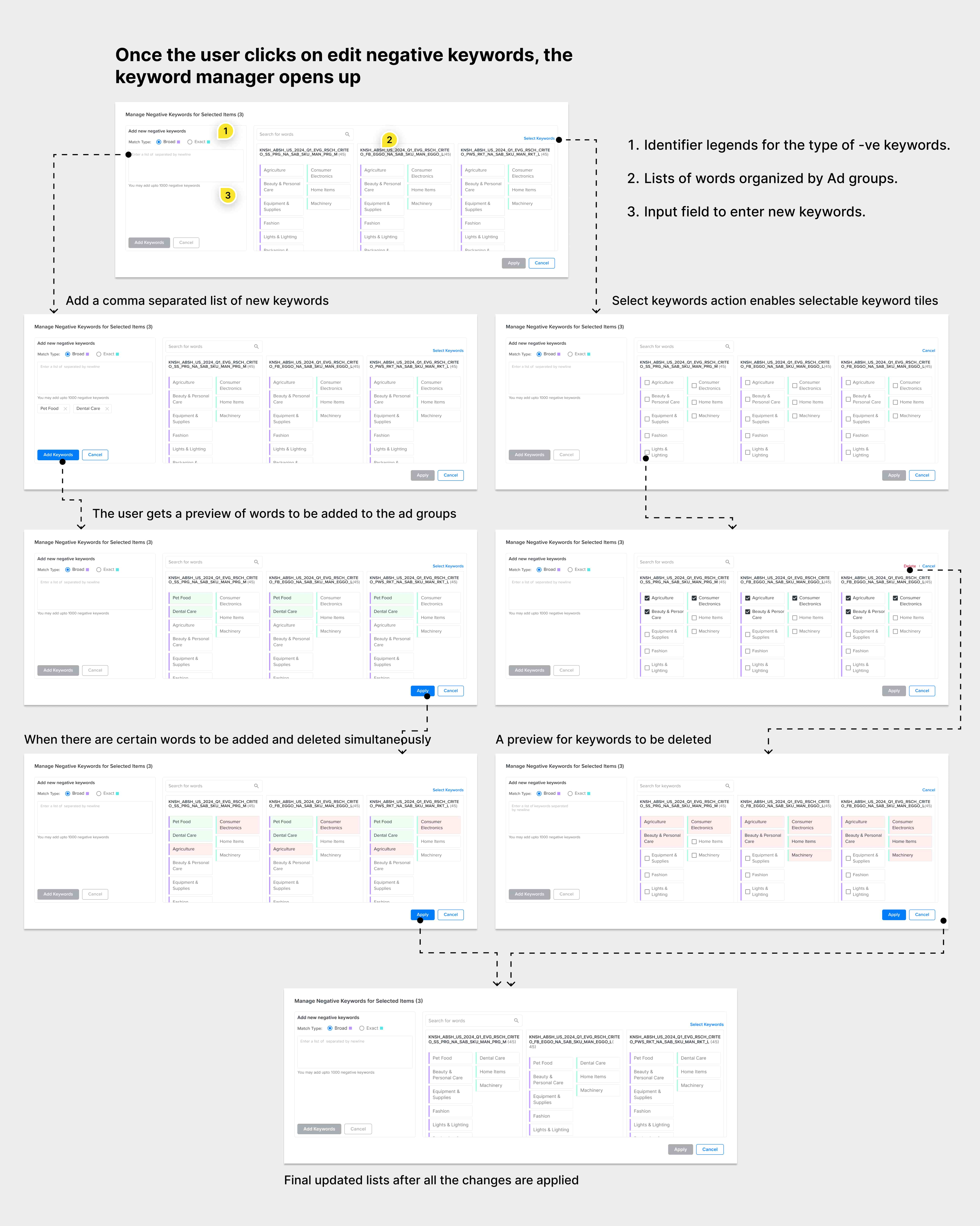
This is how the improved keywords management experience looks like
PROCESS
First solution
First solution
First solution was inspired by the thought that we can integrate the "view" and "delete" actions in the existing layout.
You can see that the layout looks similar to the existing one but with added features.

Feedback Round 1
Feedback Round 1
Feedback Round 1
The list of keywords is not scalable
The list of keywords is not scalable
Firstly, it involves both horizontal and vertical scrolling which is not a smooth experience. Considering the worst case scenario that the user selects 50+ rows and each row has 100+ words then the information becomes too overwhelming for the user.
Firstly, it involves both horizontal and vertical scrolling which is not a smooth experience. Considering the worst case scenario that the user selects 50+ rows and each row has 100+ words then the information becomes too overwhelming for the user.

Repetition of words causes information overload
Repetition of words causes information overload
The layout was designed in such a way that even if there are common words among different ad groups, they are shown separately. This creates a lot of unnecessary repetition of words which is not desired by the user.
The layout was designed in such a way that even if there are common words among different ad groups, they are shown separately. This creates a lot of unnecessary repetition of words which is not desired by the user.

1ST ITERATION
Addressing Feedback
Addressing Feedback
Pivoted view of keywords
Pivoted view of keywords
To avoid this repetition, I decided to keep the "Add" flow as it is and pivot the list view on keywords. Now, instead of an expanded widget, there would be a side drawer, the number associated with every word would indicate how many selected items it's a part of.
The new design was helpful in reducing the information overload. It also helped in solving the problem of vertical and horizontal scroll.


Feedback Round 2
Feedback
Round 2
Feedback Round 2
Having two separate layouts for "Add" and "Remove" is not an ideal user experience
Having two separate layouts for "Add" and "Remove" is not an ideal user experience
Having the expanded widget for adding and a side panel for removing keywords did not provide a consistent experience. Add and remove are two similar actions on the same item, i.e. keyword list. Hence they should be part of same flow.
Having the expanded widget for adding and a side panel for removing keywords did not provide a consistent experience. Add and remove are two similar actions on the same item, i.e. keyword list. Hence they should be part of same flow.
Too much whitespace in the list view
Too much whitespace in the list view
This layout for keywords did not optimally utilize the white space especially when the rest of the dashboard is very information heavy. If the list scales to 100 words then it would take a long scroll to browse through the list.
This layout for keywords did not optimally utilize the white space especially when the rest of the dashboard is very information heavy. If the list scales to 100 words then it would take a long scroll to browse through the list.

2ND ITERATION
Addressing Feedback
Addressing Feedback
Addressing Feedback
More compact design with integrated experience for adding and removing words
More compact design with integrated experience for adding and removing words
In this iteration, I combined both the experiences and optimized the white space. Have taken into consideration following decisions while designing this layout.
In this iteration, I combined both the experiences and optimized the white space. Have taken into consideration following decisions while designing this layout.

1. Reducing interaction cost
1. Reducing interaction cost
When it came to deleting multiple words from the list, one option was to make the user first select words and then delete. Instead, I chose to keep it one click delete. Two reasons - number of clicks are less and most of the use cases are for deleting a couple of keywords at a time.
When it came to deleting multiple words from the list, one option was to make the user first select words and then delete. Instead, I chose to keep it one click delete. Two reasons - number of clicks are less and most of the use cases are for deleting a couple of keywords at a time.
2. Choice of colors
2. Choice of colors
I chose two complementary colors to make it easy to distinguish between two types of words. The colors have minimum contrast of 4.5 to adhere with WCAG 2.2 guidelines for accessibility. They align well with the existing dashboard theme and are not over-emphasising the match types.
I chose two complementary colors to make it easy to distinguish between two types of words. The colors have minimum contrast of 4.5 to adhere with WCAG 2.2 guidelines for accessibility. They align well with the existing dashboard theme and are not over-emphasising the match types.

3. The order of words in the list
3. The order of words in the list
My options were chronological, alphabetical, or descending order of frequency. Descending order of frequency makes most sense when multiple rows are selected, giving the user an idea about relative occurrence of words.
My options were chronological, alphabetical, or descending order of frequency. Descending order of frequency makes most sense when multiple rows are selected, giving the user an idea about relative occurrence of words.
List Of Keywords
List Of Keywords
List Of Keywords
Designed and iteratively improved on the display of keywords list.
Designed and iteratively improved on the display of keywords list.

Please no!
The colors are too loud and very little white space to rest your eyes.

I can't see two tile types
Just having the border color was not enough to convey that there are two types of keywords.

Hmm, looks pretty but…
This was more visually appealing than the previous two but it over-emphasized the tiles wrt rest of the dashboard.

This is the one…
Two complementary colors make it easy to distinguish and the marker was just enough to signify two types.
Takeaways
Takeaways
Takeaways
It's important that the new designs integrate well with existing product experience
It can be tempting to experiment when designing new features, whether its visual design or tweaking element interactions. However, what matters the most for the user is a consistent product experience. Sometimes, this may require us to opt for the second best design that we have come up with but that's okay.
It can be tempting to experiment when designing new features, whether its visual design or tweaking element interactions. However, what matters the most for the user is a consistent product experience. Sometimes, this may require us to opt for the second best design that we have come up with but that's okay.
It can be tempting to experiment when designing new features, whether its visual design or tweaking element interactions. However, what matters the most for the user is a consistent product experience. Sometimes, this may require us to opt for the second best design that we have come up with but that's okay.
Design System and Auto-layout are crucial to iterating quickly
I delivered this project in a span of two weeks. And this is the usual timeline of task delivery in startups, things move fast and the deadline is always "as soon as possible". I was able to hand it off in time because I could quickly incorporate all the changes that came up in feedback. And this was possible only because I used atomic design approach for building components and extensively used auto-layout for organizing layers. Helped me improve the efficiency significantly.
I delivered this project in a span of two weeks. And this is the usual timeline of task delivery in startups, things move fast and the deadline is always "as soon as possible". I was able to hand it off in time because I could quickly incorporate all the changes that came up in feedback. And this was possible only because I used atomic design approach for building components and extensively used auto-layout for organizing layers. Helped me improve the efficiency significantly.
I delivered this project in a span of two weeks. And this is the usual timeline of task delivery in startups, things move fast and the deadline is always "as soon as possible". I was able to hand it off in time because I could quickly incorporate all the changes that came up in feedback. And this was possible only because I used atomic design approach for building components and extensively used auto-layout for organizing layers. Helped me improve the efficiency significantly.