Command Central
Command Central was designed as part of the UX hackathon, organized by DubsTech club at UW. This saw participation from 650+ global participants and an esteemed panel of 25 judges. Out of the 78 teams in the "Enterprise" track, this project bagged the 2nd runner-up.
Team
2 UX Designers
My Role
UX Design, Rapid Prototyping
Duration
28 hrs
DESIGN PROMPT
Design a platform that allows the Seattle Fire Department to:
1. Discover an incident, allocate resources to it, and then create a report on it after
2. Leverage data to analyze historical incident data, identify trends, and generate insightful reports to inform decision-making and resource planning
SOLUTION
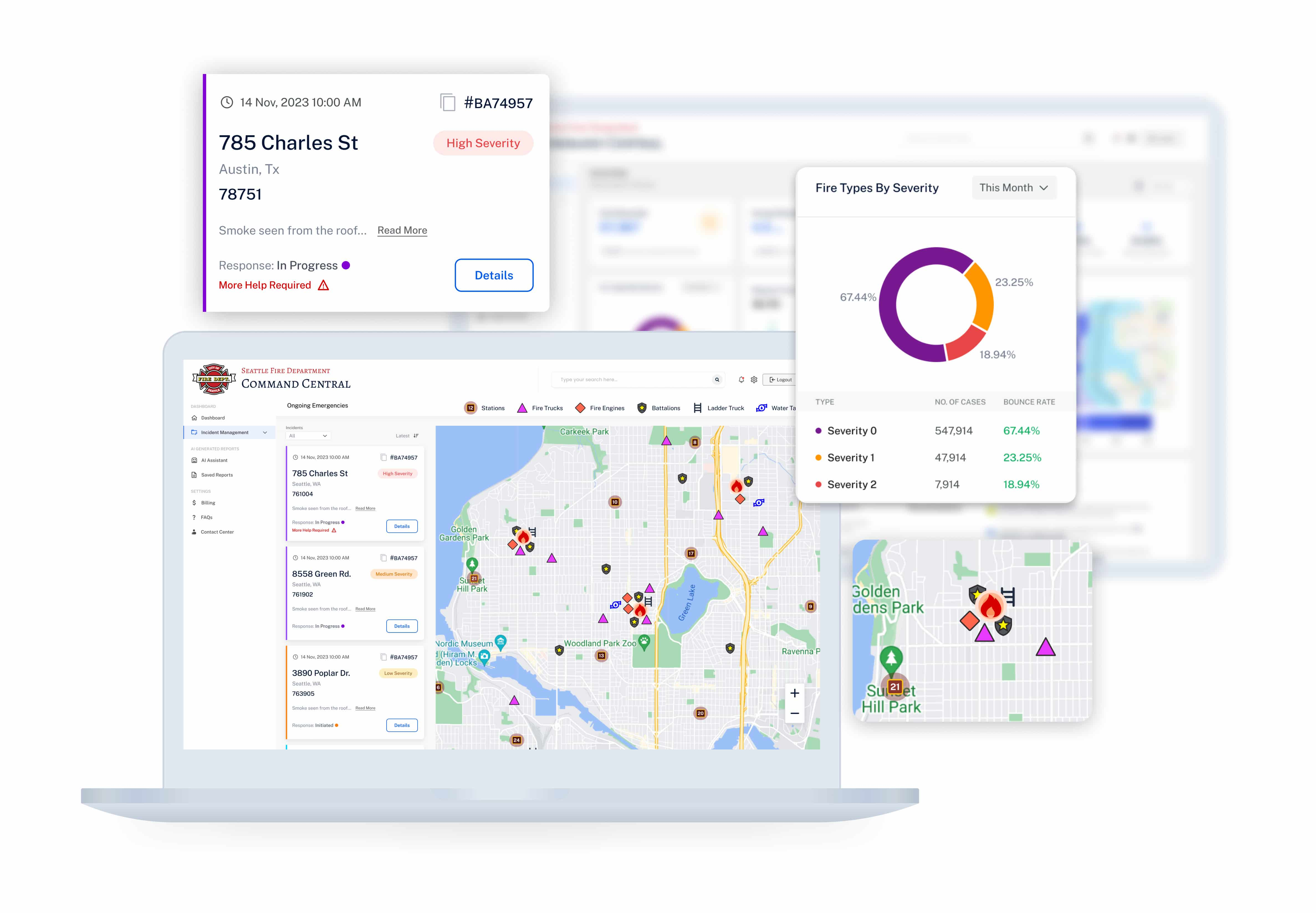
Enables the rescue operation coordinator to consume information and manage resources quickly and efficiently.
Allows customized analysis of historical data and generate insights that will help in strategic long term planning.
FINAL PROTOTYPE
PROCESS
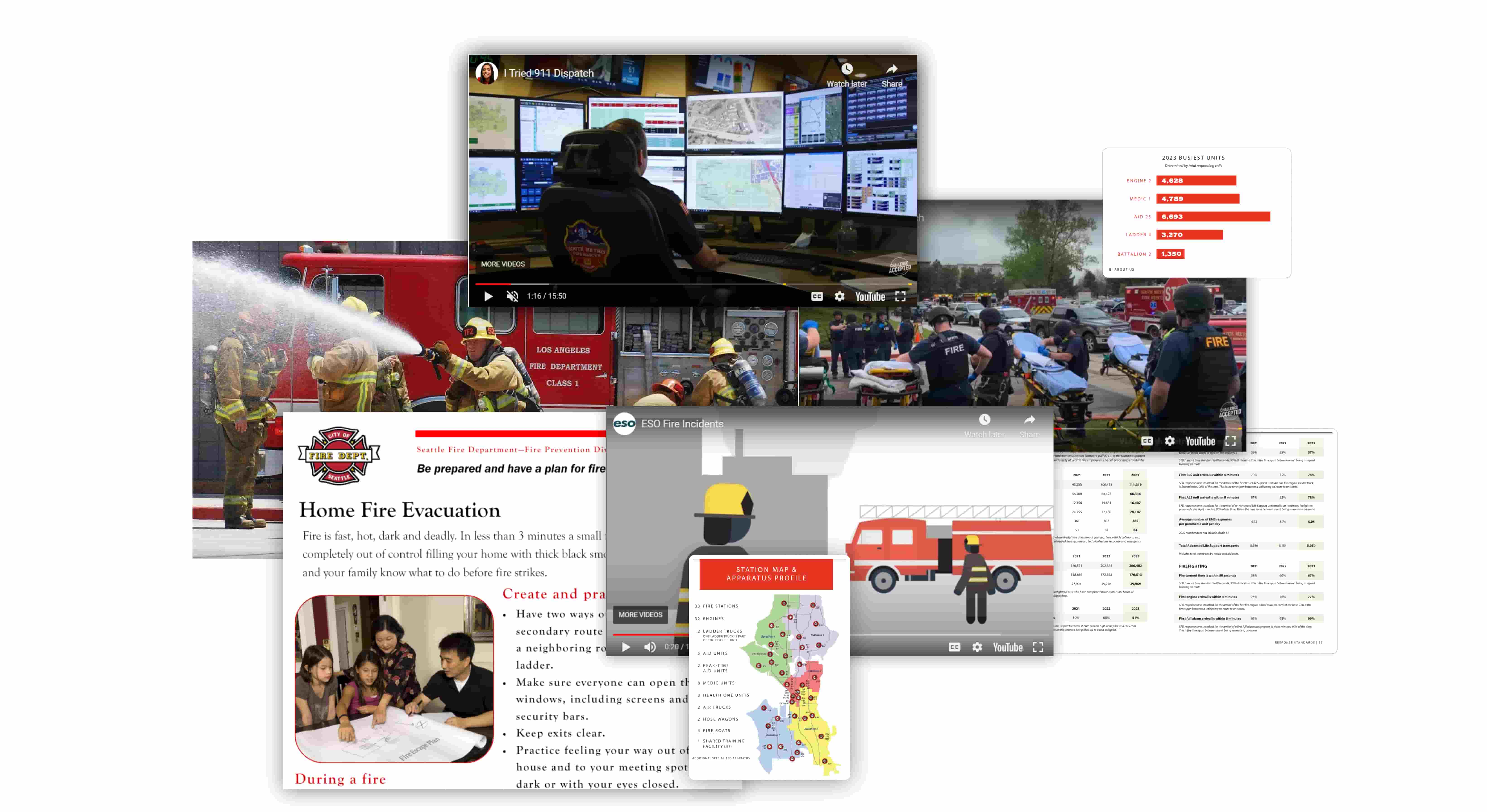
A lot of secondary research to understand the operation of a fire department
We spent significant time on this step as it was crucial to understand how fire departments work. We looked at articles, Youtube videos, various fire department websites, and even reached out to relevant people who can help us understand what goes behind the scenes.
We even tried contacting the Seattle Fire Dept., but they could not respond to our request on non-emergency helpline (understandably so :))
Well, we have the basics ...
This information we gathered helped us understand few key aspects -
Key stakeholders in a rescue operation
Type of emergency calls that the department responds to
What resources are involved during an emergency response
What are key metrics tracked by the fire department
How do we enable the Seattle Fire Department to achieve their goals?
1. We decided to design a web portal because there are a lot of information points involved and the coordinator requires to consume that information and navigate between different pages as quickly as possible.
2. Secondly, we created a mind map that helped us identify key elements in each of the flows that would support jobs-to-be-done.
3. Once we were clear what we are designing, we divided up the work. I picked up the incident management workflow and the data dashboard.
A ticket based incident tracking dashboard
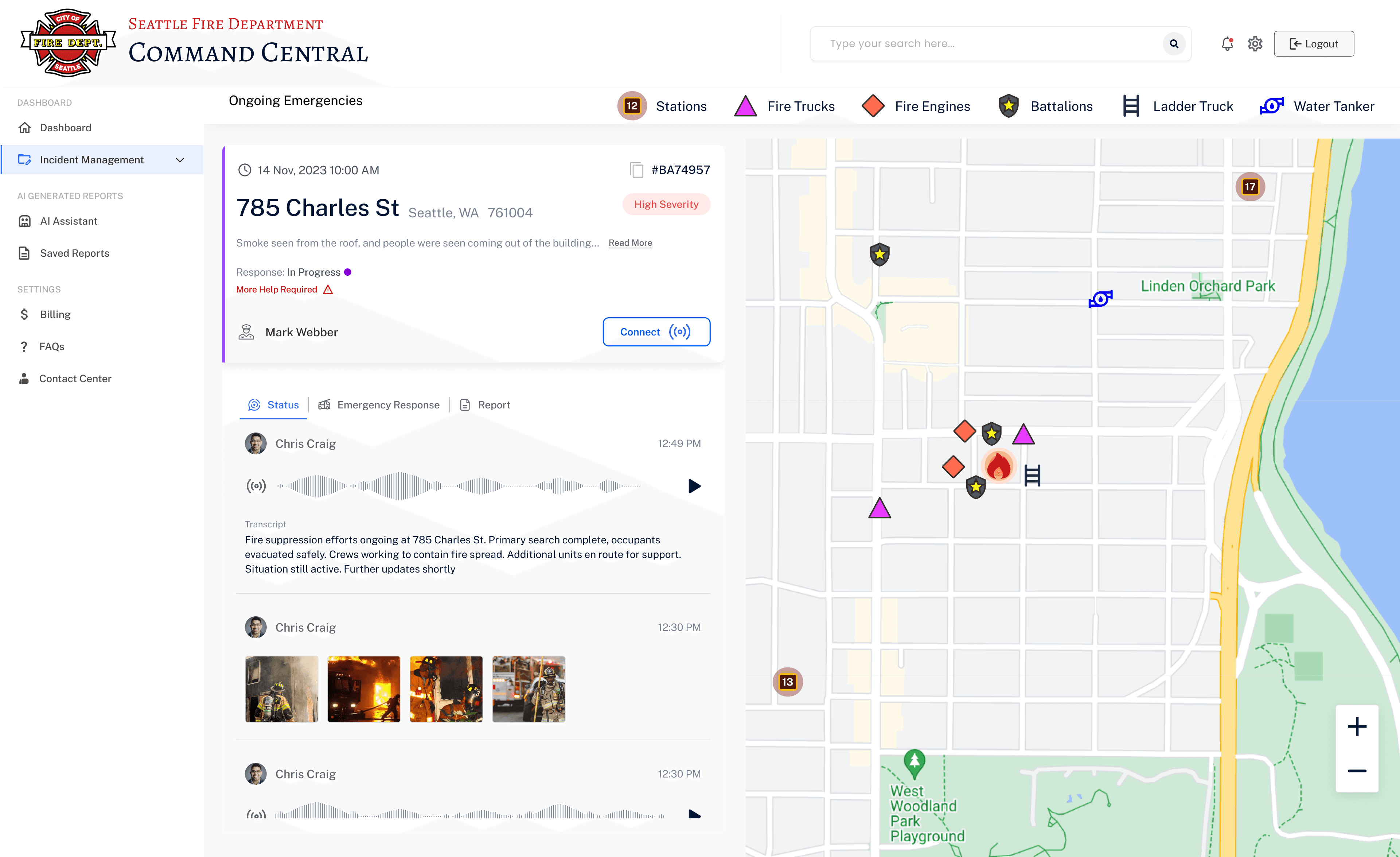
Real-time status update with resource tracking
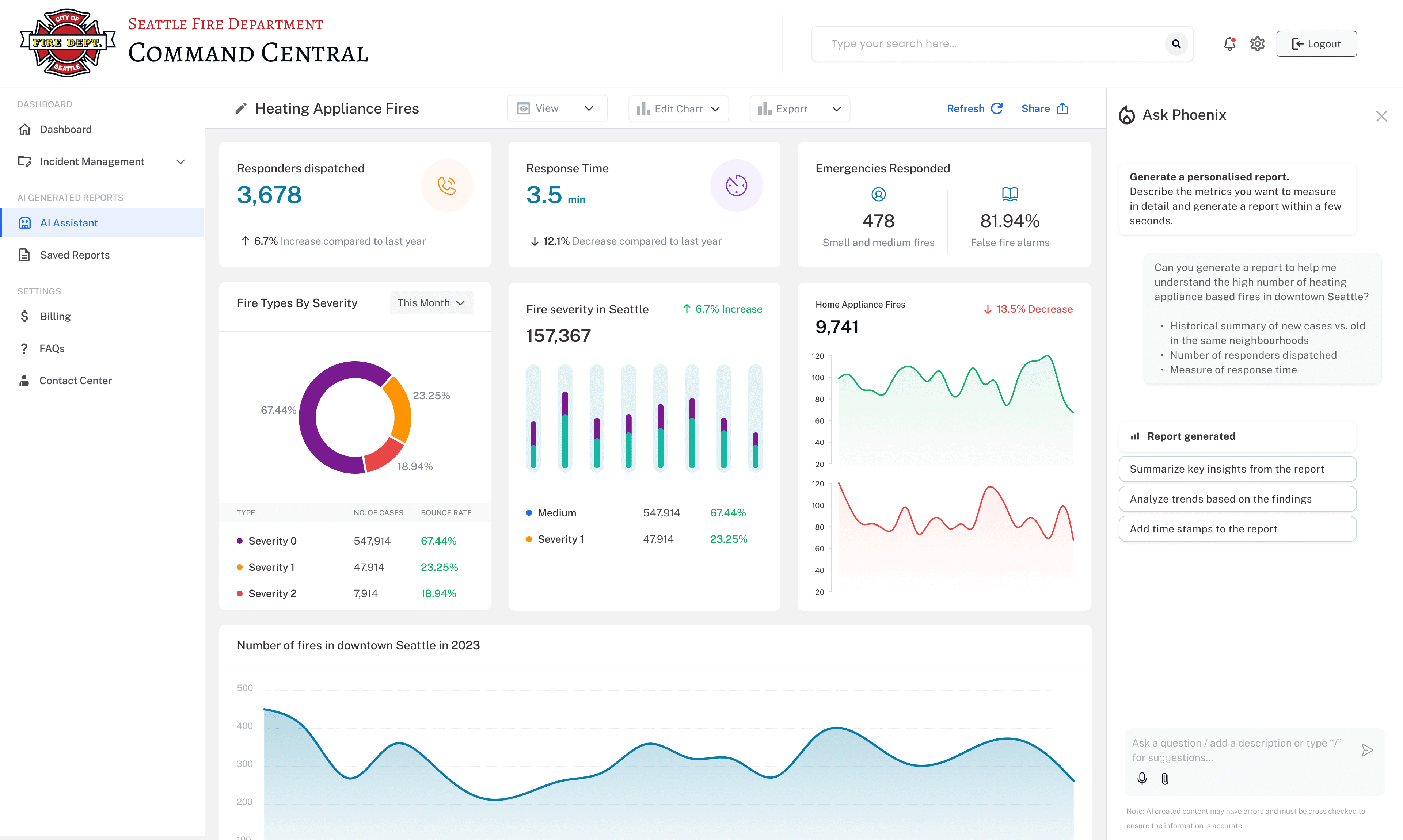
A dashboard to interactively visualize historic data
AI Assistant to generate customized reports
Design Decisions
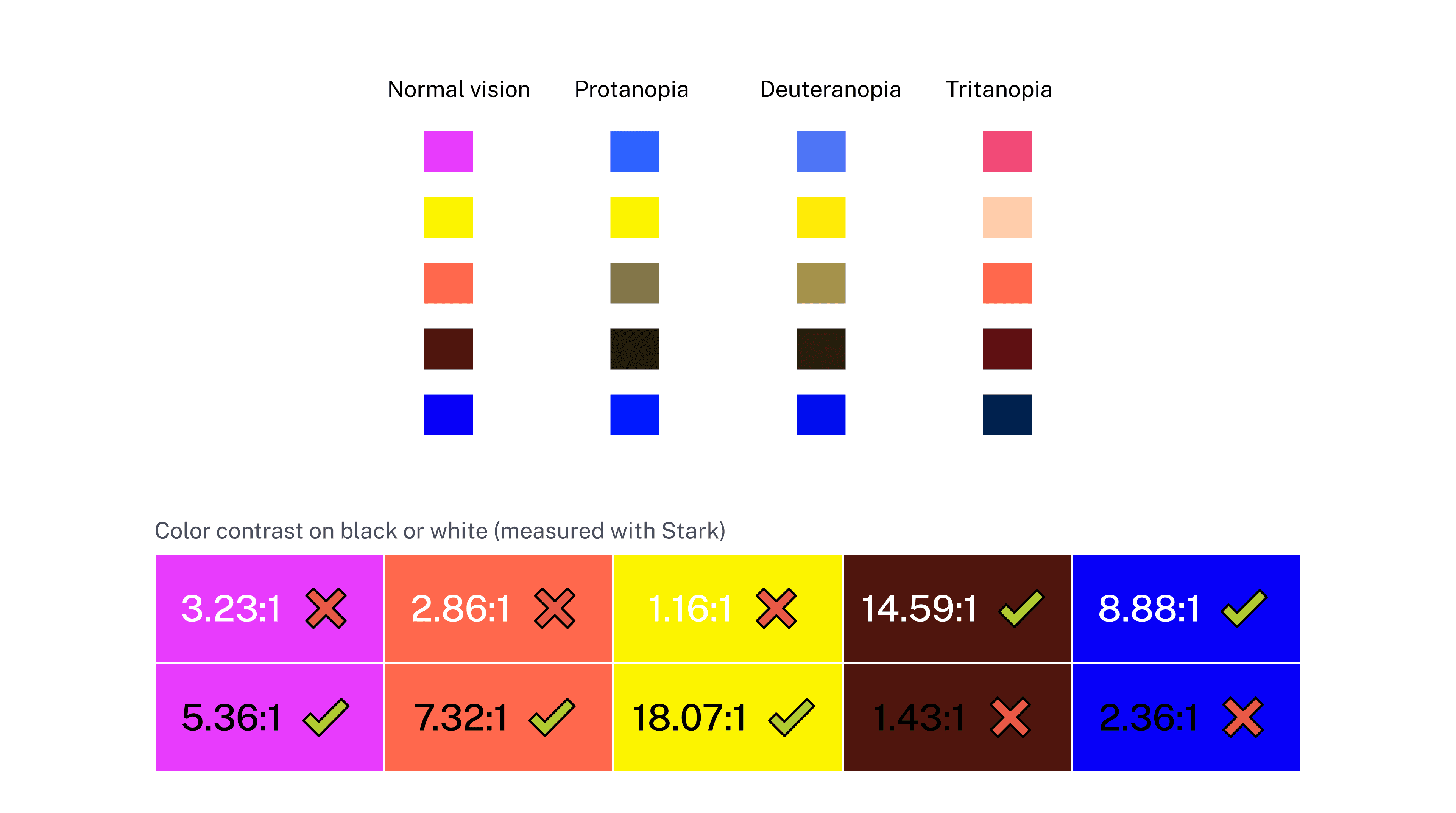
Accessible colors
The selected colors are color-blind friendly for category classification and meet AA contrast requirements according to WCAG 2.2.
Icon design ensured accessibility by removing exclusive dependency on color and ensuring enough contrast
The different shapes helped in categorization along with colors. Addition of dark stroke ensured sufficient contrast with map background.
Icons for various resources used by the Fire Department during an emergency response.
Designing incident ticket for emergencies
The layout highlights clear hierarchy of information with visual weight.
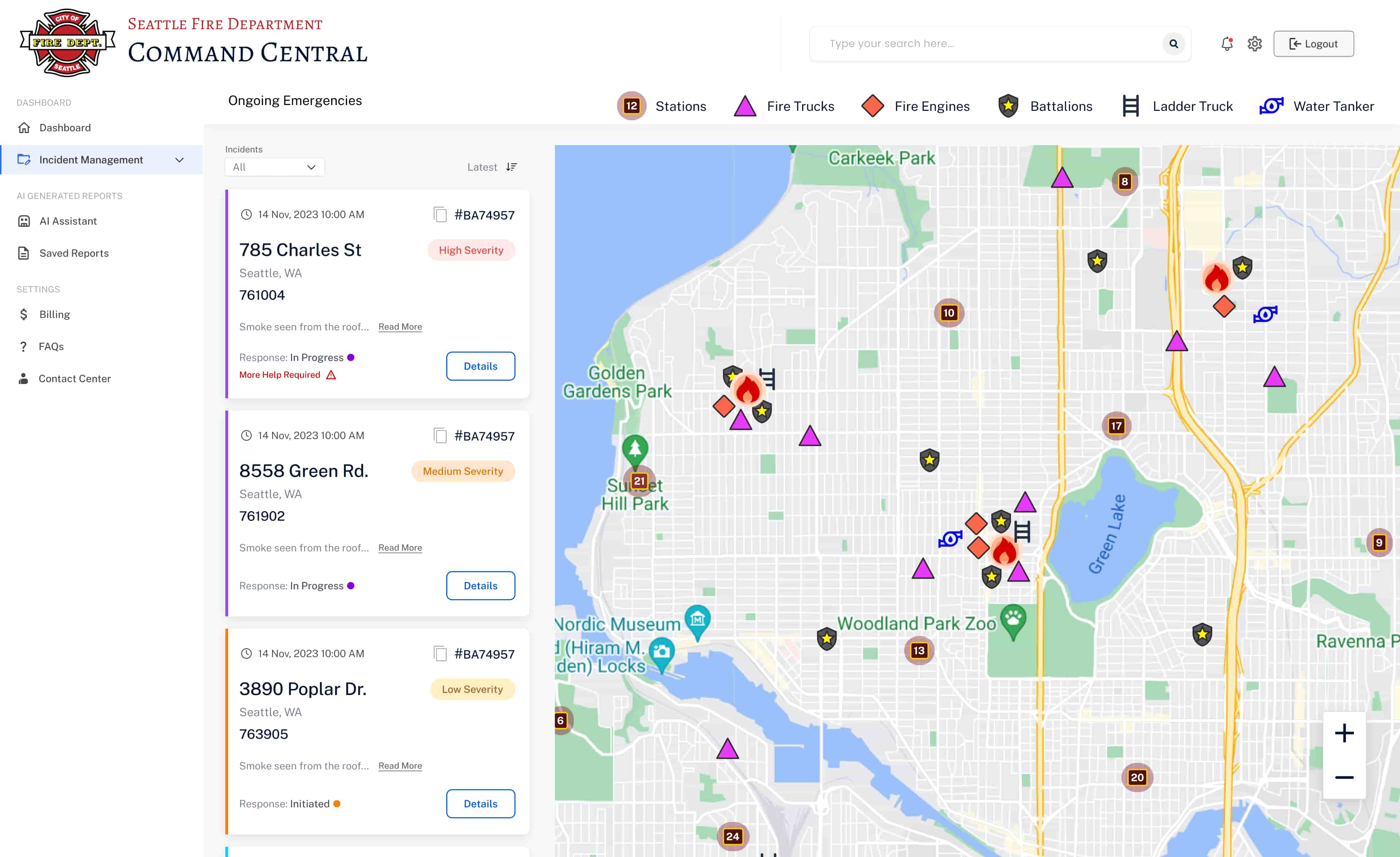
A ticket-based incident management portal
The combination of list and map view gives crucial information about incident details and real time location on the map.
1. Assigned easily differentiable icons and accessible colors to the resources.
2. All active response tickets
indicating the status of response and severity of incident.
3. Map view makes it easy to glance where your resources are located in real time.
Incident specific and resource specific views
The viewer can choose to select if they want to restrict the map display to a particular incident or resource.
Incident Details page
The user can get a zoomed in view of the incident and the details on this page. They can also assign resources and generate report using AI.
1. The response coordinator can check status updates received from the ground, manage resources and generate report.
2. All the status updates during the rescue operation will be logged in the form of voice notes received from radio along with automatically transcribed text as well as shared images.
Ability to manage resources during the emergency and generate even report with AI
The user can get a zoomed in view and incident details on this page. They can also assign resources and generate report using AI
Analytics dashboard to view past data
The user can view key metrics, geographic distribution, and trend over time in a customized time frame.
1. Key Metrics are visible right up front. Users can view data in customizable time frames.
2. Viewers have ability to look at geographic distribution of events and strategize which areas need more resources going forward.
3. AI-generated insights and recommendations to help in long term resource planning.
4. Users can look at trend over time to understand year-on-year changes or seasonality patterns in resource demands.
AI Assistant to help generate customized reports
The user can get customized reports on historic data using the AI Assistant - Phoenix.
1. The AI assistant “Phoenix” sifts through both historical and real-time data to create tailored reports.
2. The reports can be edited and easily exported.
This project offers a simplified view but the actual operation of a fire department is so much more complicated
This was a 24 hr hackathon and we tried to include as much of our understanding of the operations of the fire department as possible. But honestly there is so much more. The working of a fire department is quite nuanced with complicated protocols, involvement of other departments, and many intermediate steps involved in a fire response. The types of fires can range from false alarms to big grizzly wildfires and accordingly the responses are so different. Another important aspect being, the response of a fire department is not only restricted to fire emergencies, they respond to other emergency calls such as vehicle collisions, medical emergencies and so on.
Indeed an enriching and gratifying experience, especially to push my limits and participate in a 28 hr creative sprint.
The hackathon began the day after I finished my Master’s coursework, it was totally optional. Exhausted from weeks of late nights and grueling assignments, I nearly didn’t participate. But I summoned every ounce of energy and determination I had left.
Right from forming the team, to brainstorming, to dividing up the work, to prototyping like crazy, we raced against the clock to present our work. Despite the tight deadline and fierce competition, we placed 2nd runner-up.
This project wasn’t just about winning; it was about pushing my limits and proving to myself that I could overcome exhaustion and doubt to achieve something remarkable. The whole experience was nothing short of exhilarating.
